Its easy and efficient user interface is one of Nextcloud’s biggest advantages over the competition. The upcoming Nextcloud 14 introduces a series of improvements to make Nextcloud even easier to use and also more accessible to people with visual disabilities. In this post we detail the new themes, keyboard accessibility improvements, screen reader support as well as general Files design improvements.
Design improvements
User interface design is about more than being pretty. The goal is to allow users to get work done with the least amount of effort, making it obvious how to accomplish tasks and reducing the number of steps needed to do so. To reduce clutter in the interface, the shares in the left sidebar are now part of a tree view, collapsed by default (but it remembers its state across sessions). The Favorites item is updated to also show a tree view of folders that are favorited and also remembers its collapse state. Have a quick look at how this works in this YouTube video:
As you see in the video, we also added a Deleted shares section. If you’re part of a group who has files shared to them and you remove such a share, you can bring them back from the Deleted shares as long as you’re in the group. Another thing you can see in the video is that we show the avatars of people who shared with you! We will cover that and other collaboration improvements in another article, stay tuned!
Other improvements include the new ‘welcome to Nextcloud’ for new users and the popup showing what’s new in this release. We also made Nextcloud work better on small screens like mobile or tablet devices!
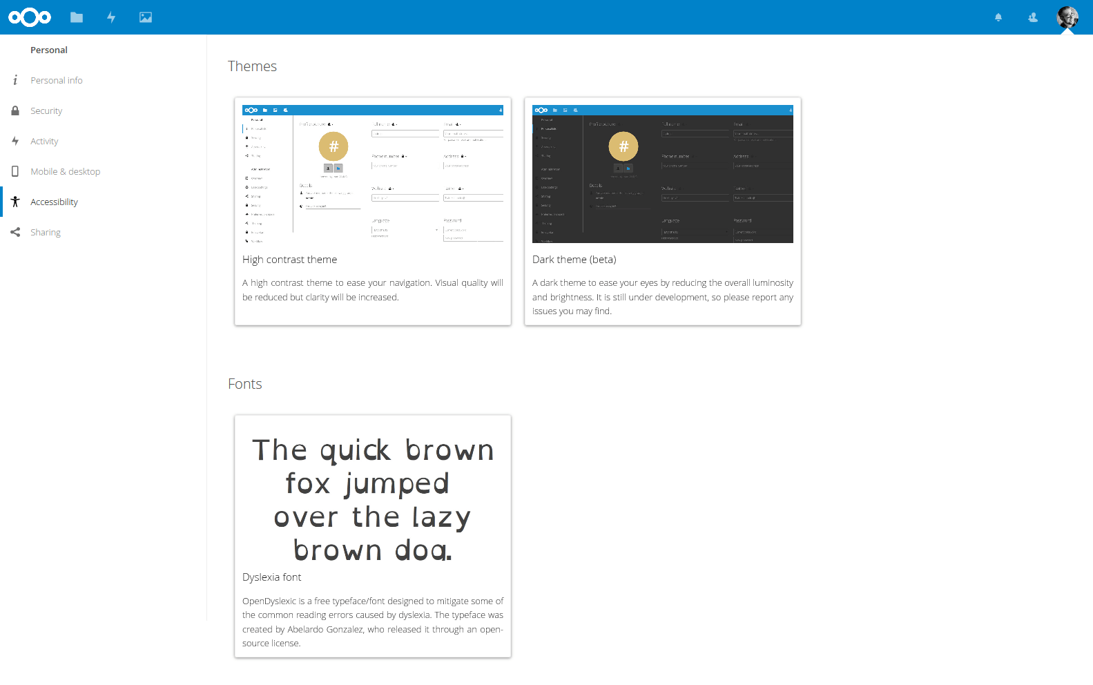
Accessibility settings: high contrast and dark theme, special font
Accessibility
We want Nextcloud to be easy to use for everybody. To help users with visual impairments, we’ve introduced a lot of changes to improve keyboard accessibility and the screen reader experience. We introduced labels and keyboard navigation for elements like the settings and contacts menu, notifications and the upload menu as well as the addition of skip navigation/skip to content links. Much of this work was extensively tested and guided by several community members using these devices, so a big thank you to them for their contributions!
The colors used in Nextcloud have been updated to meet the WCAG 2.0 AA standard for contrast and we created themes for users who need even higher support. Our High Contrast theme aims for WCAG 2.0 AAA compliance, while a Dyslexia-friendly font option helps people with reading disability. Last but not least, a Dark theme is now available.
The accessibility changes extended to our Android apps for Files and Talk, improving their screen reader support.
We’ve documented accessibility concerns and guidelines for Nextcloud developers. We use tools like the WAVE Web Accessibility Tool, aXe and Lighthouse. It is very easy to get involved, just install them and test Nextcloud or your Nextcloud app with it, and report issues to us!
Nous vous présentons aujourd'hui Nextcloud Hub 26 Spring, notre version anniversaire. Cela vous offre encore plus de choix en matière d'outils, une interface utilisateur optimisée, une collaboration fluide, ainsi qu'une nouvelle stratégie de plateforme qui permet aux développeurs de tirer davantage parti de notre vaste écosystème. Conçus ensemble, pensés pour l'avenir.
Nextcloud Hub 25 Autumn facilite le démarrage d'une collaboration puissante tout en gardant le contrôle de vos données. Des mises à jour globales du design à l'amélioration de la convivialité et des performances, découvrez notre dernière version dans ce blog.
Les organisations, petites et grandes, ont besoin d'un moyen d'assurer la résilience et la souveraineté numérique de leurs opérations - une alternative à Teams, open-source et respectueuse de la vie privée. Aujourd'hui, nous vous présentons cette solution - Nextcloud Talk.
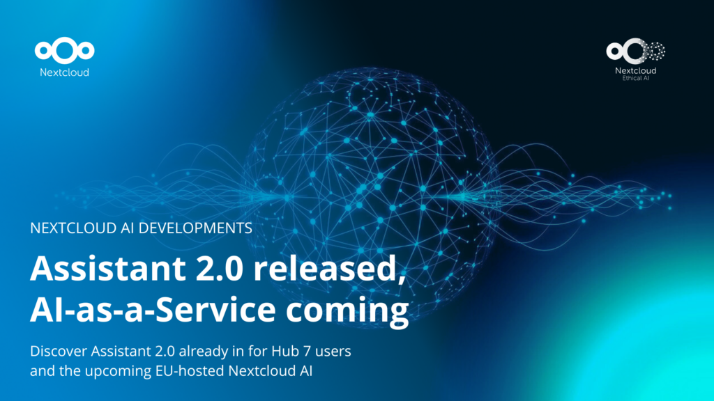
Nous vous présentons une mise à jour majeure de l'assistant Nextcloud IA, ainsi que de nouvelles informations sur notre collaboration avec plusieurs grands fournisseurs d'hébergement tels que IONOS et OVHcloud pour vous proposer des options d'IA en tant que service !
Bechtle et Nextcloud ont annoncé aujourd'hui une plateforme de collaboration entièrement administrée pour le secteur public, qui ne nécessite pas d'appel d'offres et peut être déployée immédiatement.
Découvrez comment passer de ownCloud à Nextcloud. Notre outil d'aide à la migration fournit des informations sur le processus de migration et vous aide à effectuer la transition en douceur.
Starting with Nextcloud AIO v13.3.1, you can register a free, automatically configured domain with DNS records via deSEC to streamline setting up your Nextcloud.
We are introducing the Nextcloud ISV Partner Program to support independent app developers through the Nextcloud app store. Read more in this article and get in touch with our team if you want to join the program.
Nous enregistrons certains cookies pour compter les visiteurs et faciliter l'utilisation du site. Ces données ne quittent pas notre serveur et ne sont pas destinées à vous suivre personnellement ! Consultez notre politique de confidentialité pour plus d'informations Personnaliser
Les cookies utilisés pour enregistrer les données saisies dans les formulaires, telles que le nom, l'adresse électronique, le numéro de téléphone et la langue préférée.
Nom du cookie :nc_form_fields
Description du cookie :Mémorise les données saisies dans les formulaires pour une prochaine visite (nom, adresse électronique, numéro de téléphone et langue préférée).
Expiration du cookie :30 jours
Consentement
Nom du cookie :nc_utm_parameters
Description du cookie :We use cookies to store UTM parameters from your visit so we can understand how you arrived at our website.
Les cookies statistiques collectent des informations de manière anonyme et nous aident à comprendre comment nos visiteurs utilisent notre site web. Nous utilisons la solution open source de mesure de statistiques web Matomo
Service:Matomo
Description du cookie :
_pk_ses*: Compte la première visite de l'utilisateur
_pk_id*: Aide à ne pas compter deux fois les visites.
mtm_cookie_consent: Se souvient que l'utilisateur a donné son accord pour le stockage et l'utilisation de cookies.
Expiration du cookie :_pk_ses*: 30 minutes
_pk_id*: 13 mois
mtm_cookie_consent: 30 jours